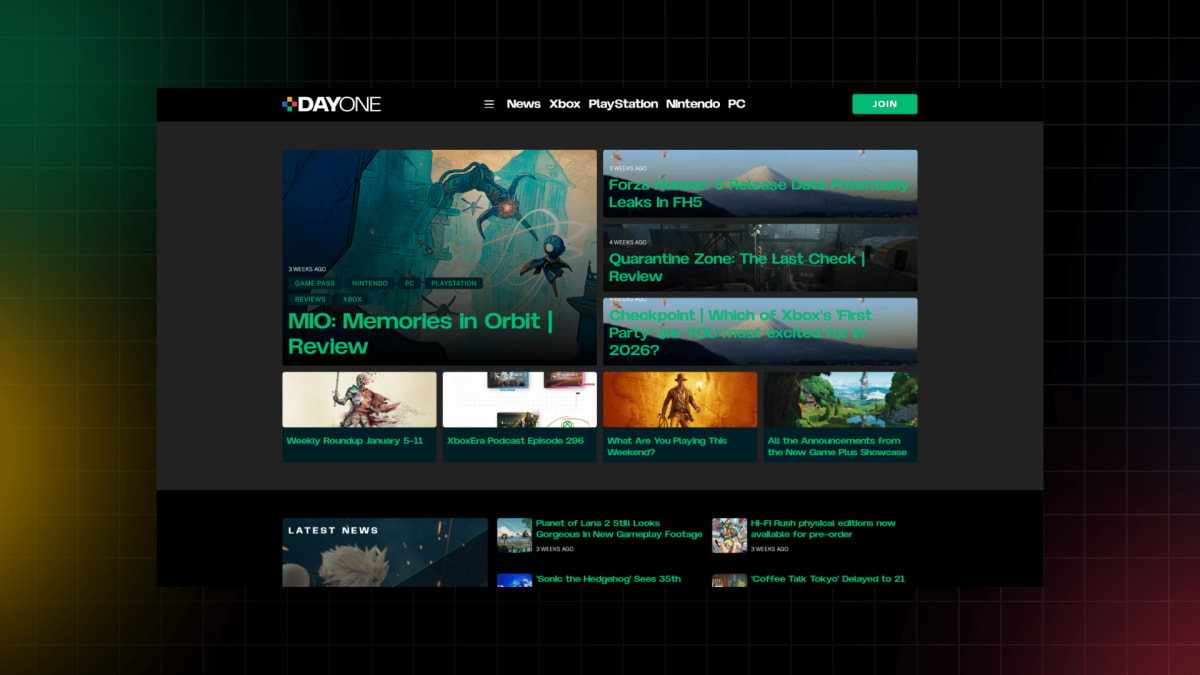
We’ve been working diligently over the last few months to craft something modern, slick and fun to browse, but while we’ve done our own testing, it’s really time to bring you lot in and let you loose on the new digs.
So, please - have a look around. We’re already aware of some non-urgent things we need to fix, but we definitely want to hear from you on readability, issues on mobile, all of that fun stuff.
Memberships are coming, and we hope be inviting existing members and patreons to help test that functionality in the next few days.
Drop your feedback here so @Predrag and I can tackle and adjust accordingly. Links and screenshots are most appreciated.
Wow. Looks great. Nice work Jon and predrag. I admit I’m a slow reader but I used to hate that first box on the old site that would auto scroll. Of the 4 or 5 boxes I would have read up to like the second one and it would scroll. Drove me crazy.
New site looks slick and better organized. Keep up the great work!
Jon - I don’t know where else to post a suggestion so will here. On the mobile forums phone app if possible, on the page that lists all the threads, drop the microscopic image. It is so small it doesn’t add much and becomes clutter. This would also free up space so more threads will show up on a single screen. Same comment for the icon of the last poster. Not super important info to have and takes up a lot of space. Removing these two things would go a long way in decluttering the mobile forum threads list.
At any rate, your team has done a great job on this transition. We all standing by while you work on the subscription feature next. All this hard work will pay off!
EDIT: Reading your comment again, I think you’re definitely referring to the latter - I will tag @Predrag and see if this is something we can adjust! Cheers.
It’s great to see so many people say they like it - but I want to hear what you feel needs to be improved! This is something we can adjust and iterate on very very quickly, so feel free to make requests and share your desires.
Overall, I love the new design, and the site looks much cleaner, but a couple of things I found could be better-
The width of the site, everything is quite narrow, leading to loads of wasted space on the sides, I wonder if the comments width could be increased a bit to increase the information density on PC.
Colored emoji’s for the reactions, currently black and white and not very eye catching.
Really like the new site, but is there a way to get a light theme? Couldn’t seem to find it if there is one. I know lots of people love dark/night themes, but I struggle to read articles with dark backgrounds as it creates a venetian blind effect in my eyes after a couple sentences.
I think he’s talking about the main site and not the forum, but either way - that’s probably a larger ask that @Predrag would have to weigh in on as to whether it’s something we could do. I think we went permanent dark mode because it’s the most used version, and ergo, easier for us to maintain and update.